Cole Nussbaumer Knaflic Speaks: Storytelling with Data
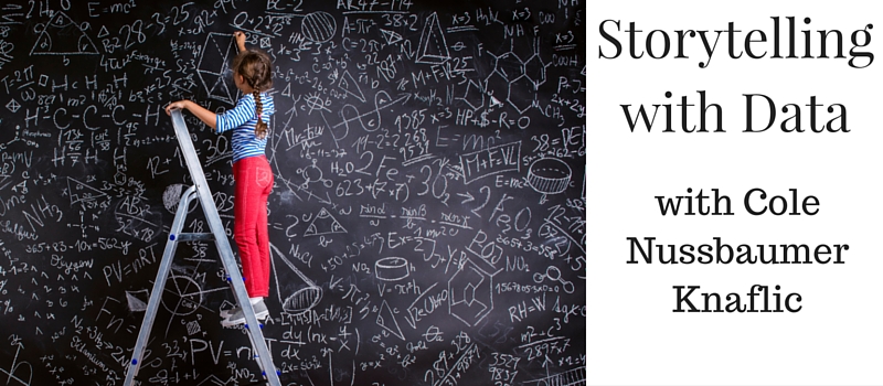
Cole's goal is to help rid the world of ineffective graphs, one exploding, 3D pie chart at a time. She's always had a penchant for turning data into pictures and into stories and wrote Storytelling with Data capture her point of view.

In a hurry? Click this link to ---> download the interview transcription
Alzay Calhoun: Well, hello everyone. It's Alzay Calhoun with Coveted Consultant. Today I'm here with Cole Nussbaumer Knaflic, and she is an expert in storytelling through data.
As a matter of fact she's written a book on the topic and we're going to let her introduce herself and that book in just a moment. But first, let me just say, "Hello." Cole, how are you doing today?
Cole Nussbaumer Knaflic: Hi, Alzay. I'm doing great. Thanks for inviting me.
Alzay: Yes, indeed. Good to have you. So what's the title of that book?
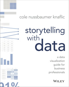
Cole: The booked is titled "Storytelling with Data." It's a data visualization guide for business professionals.
Alzay: Now, I want to be the voice of someone that's listening right now. We're talking about Storytelling with Data here. If that's not a boring topic [laughs] ...that's the kind of topic that most folks would be concerned about. They think it's going to be boring, let me say it that way.
Let's start here. When did you realize that Storytelling with Data was an important tool set to have?
Cole: Yeah, great question. For me, I grew up on the data side of things. Personally, I don't think it's inherently void but we can talk about that. My career has always been in analytic, first, in banking in Curter as management, then in Google and HR Analytic.
For me, there was something about being able to take data and make it visual and tell stories with it that helped it resonate with people. Helped people understand it better and helped drive more action, when you can see something and make it so clear, what sort of the next step is with that data.
Alzay: Is it just kind of yes or no, or perhaps your perspective here. Is it important to have someone in your organization, who specializes in data the way that you do?
Cole: It certainly is helpful, I think. Any organization that has data, which you figure is every organization ‑‑ every organization has got data on something. There is a growing desire to be data driven and make decisions based on data which is a fantastic goal.
So, having somebody at your organization who understands data ‑‑ who can take it from numbers and spread sheets and turn it into information, you can actually learn something from and then do something with, can be huge or comes as an advantage.
Alzay: If I wanted business and I'm sitting in my office and I'm looking at my team. I'm looking around those who work around me and I'm about to delegate someone to be my data person. Is that the approach I should go, should I delegate a data person or should I hire a data person, help us think about this.
Cole: I would go for the latter, to hire a data person because it's tough for somebody who has not been trained in a quantitative field to just start doing stuff with data.
That's not to say it can't be done. Certainly that's one way to tackle it, but there are some things when it comes to how you structure a problem, how you think through a problem, how you actually define that, what assumptions you make from a mathematical level, that are helpful to have somebody who has had education or experience in that space ‑‑ when that's possible.
When that's not possible, yeah, you look to your team and say, "OK, who maybe has an interest in this, or who shows natural aptitude here," and then tap that person, make them your data person, and figure out what sort of training or additional support that they may need to be effective in that role.
Alzay: For those who may not be the most familiar with this, are we talking about hiring a data scientist? Are we talking about hiring an engineer?
Cole: Data science is one of these terms that is becoming very popular, getting thrown around all over the place. Data science, all it means to me is somebody who knows how to work with data.
That can be people from a number of different quantitative disciplines. It could be somebody trained in economics, or operations management, but somebody who is comfortable with numbers. Is comfortable, again, taking that step of turning those numbers into information that somebody can act upon.
Alzay: Now that we feel better about what data is and who would use this stuff, talk to me a bit about, as the CEO of a company, the highest leadership position, what kind of data should I be looking at?
Cole: Anything that's going to be critical to your business, that's going to help you make better decisions. It's hard to answer that specifically for a general scenario like that.
But you want to think about what sort of data do you have access to or could you be collecting that might bring you that competitive edge, that's something that nobody else has. Or what do you know about your customers, what sort of insights could you pull from that that you could use to drive strategy?
Data exists everywhere, it's just a matter of figuring out where is it, how do we capture it, and then what can we do with it.
Alzay: I want to ask you a bit of a loaded question, and let's see what happens. Whose job is it to decide which data is most important?
Cole: That's a tough one, again, to answer in the hypothetical. Those decisions get made at all levels of an organization ‑‑ from the analyst who's the one crunching the numbers and figuring out, "What do I show? What do I not show?" or "What do I share? What do I not share," back to the CEO, of helping to determine, "Where do we go in different markets, and what data should we use to inform those decisions?"
I don't think there's once central place where that's happening, nor do I think there's one central place where that should be happening.
But transparency is important there so that you know what data is there, what data you are looking at, what data you aren't looking at, so that you can understand the assumptions that are going into that.
Alzay: The reason why I asked that question was because...and you kind of followed my lead. Thank you. The reason why I asked that question was to make the point that we've got to have some shared vocabulary on how we talk about, and how we think about data.
If we just hire a "Data person" and tell them to "crunch" the data that doesn't mean that what we'll get is useful to us and vice versa. If we tell them what we want to see it doesn't mean because we get that it's, again, useful for us.
Your book is about giving some construct of some common‑language vocabulary framework around that. Now, please, you tell me and tell us where should we begin thinking about applying data as you've written in your book?
Cole: For me I draw a distinction between exploratory data for exploratory purposes and for explanatory purposes, where on the exploratory side you're digging through it. You as the analyst ‑‑ in this case, primarily.
You're looking at it through different lenses. You're combining it in different ways to figure out, "What's interesting here? What can I learn from this data that somebody else might care about?"
Then once you've identified the thing, or the things, that somebody else might care about then we move into explanatory space. That is where you have something specific you want to communicate to somebody specific. And the book is really written with this ladder space in mind.
You've identified something, right? You've turned your data into information. Now how do you visualize that in a way that's going to create that magical "Aha!" moment that graphs so well ‑‑ can do so effectively. And how can you not only show data but also build a story around it to resonate with your audience. To help the data stick with your audience, and to help ultimately drive them to action.
Alzay: Tell us about "Storytelling with Data" then. Not only do you want to show it but you want to tell a story.
Cole: Yeah.
Alzay: How do numbers tell a story? How do I even think about that?
Cole: Yeah, it can take different forms, right? You can think of, if it's a single graph that you want to walk your audience through and leverage components of stories you could start with a blank graph and then animate one point to appear.
Talk about that data point and the context around it and the environment. Then show what happens to that over time and talk about what that means and therefore where you should go with that.
Or you can take a step further back than that and think about, "What's the overarching story? What's the big idea? What's the main message that I want to get across to my audience?" And now, rather than starting with the data, you start with the story.
So say, "What is it I want my audience to do and who are they? What do they care about? What keeps them up at night? What resonates with them?" And then figure out how you can sprinkle data through that story to help really convince people.
Because I think that's one of the big rules that data plays is in helping people not only understand how to act or what decision to make but also why. It's not just, "This is my opinion." It's, "We've looked at some data and here's what we think it tells us."
When I think story, I think story in the traditional sense. Where you have a plot and you have twists and you have an ending and there are characters and there's conflict.
You want to think about how you can leverage each of these things when it comes to grabbing your audience's attention, maintaining your audience's attention, and again helping these data points. That on their own, typically aren't so memorable, become memorable. And story is one of the things that help us do that.
Alzay: If we're talking about Storytelling with Data, again I'm thinking about a propeller head. Right? I hired a propeller head to do my data work. Now I'm asking my propeller head ‑‑ and no offense meant to you or anyone else that's listening ‑‑ but that's kind of how I visualize it.
I'm asking this person now to tell me stories through that data. To use the tools you just described. And I'm concerned if that person can do both.
Cole: Yeah and that is...
Alzay: Help me understand that...
Cole: That's a totally valid concern. Because where I think you're getting this propeller head image is people who know how to work with data typically have come up through a very quantitative, very analytical, path. They're statisticians, they're mathematicians. They're people who are buried in spreadsheets [laughs] and computer programming.
It actually is a big shift for somebody who's been classically, quantitatively trained to not only show the data but then also tell stories with the data. It's a little unfair, I think, to expect your data person to suddenly be able to do that.
This is where there should be, and where there's a lot of potential to have synergies from other parts of your organization, where it's not just the data person, it's the data person working with the marketing person, or somebody there who is adept at telling stories, but maybe doesn't have the technical, quantitative background.
You're right that it's hard to get both of those sides in a single person. People have, typically, either been trained on the quantitative side, or they've been trained more on visual design, storytelling, and communications.
I will say, as an aside, there's more focus, in general, on this, so going forward we will hopefully see more people who are comfortable flexing with both sides, but in absence of that, then you really want to think about, "Who do I have in my organization who I can pair together to combine those things?"
Where on the business side they can bring the context, they can bring the story, and they can bring that higher level of thing that helps connect the pieces, and then your data person can help figure out, "Where can we put data into that," or, "Where can we use data to help drive the story?"
Those people working really closely together can be one way to attack this.
Alzay: What you just said is that really we should have a team approach to thinking about how we use data.
Cole: Yeah, at some potential, for sure.
Alzay: Instead of necessarily siloing that concept ‑‑ data area/data people ‑‑ we think about that as a team. There still might be those who cull it, who grab it and shift it and play with it, et cetera, but when it comes time to using it, speaking about it, communicating about it, we should do that as a team.
Cole: There could be some benefit in that, yeah, absolutely.
Alzay: Now I want to jump to presenting data. I want to jump to some of the ways, some of the frameworks and thoughts that help us present data in a healthy way.
I heard that you're not a fan of pie charts.
Cole: This is true. [laughs]
Alzay: Please explain why that's not your favorite way to present data.
Cole: Pie charts are not my favorite, because our eyes, when you think about how people see, we're just not good at ascribing quantitative value to two‑dimensional space. Which, said more simply, means that pie charts are hard for us to read.
We're trying to compare areas and angles, which we're just inherently not good at. Which seems counterintuitive, because pies are one of the first graph types that we ever encounter, or learn how to read, and so pies, their sole use is or should be to show parts of a whole.
They're the most effective chart type for doing that, and they make it very easy to see when one slice is much bigger than the others, or one slice is much smaller than the others. What they don't do a good job of is as soon as you want to start comparing those slices, and if anything is close in size, or you can imagine the pies you've seen that have like 50 segments, and they're all different colors, and they're just impossible to get anything out of.
Pies are probably one of the frequently misused type of chart. I tend to avoid them altogether, because I think that there are more effective ways to show the data ‑‑ bar charts, often.
A simple bar chart will allow both of those comparisons, so you can see how much a category makes up of the total, but then also the incremental difference between that category and other categories.
Alzay: If I could just add a quick note, my favorite is when a pie chart has 10 different elements in it, and they have to write arrows to the different areas.
Cole: Lines everywhere. [laughs]
Alzay: Yes, because they can't fit the text inside the area. You said, "Use a different way altogether."
Moving on, can you explain this one thing that I saw in your presentation, visually, that might be hard to articulate, but you did a threes exercise. You said, "Count the number of threes that are on this slide, ready, one, two, three."
Then you say, "Do it a different way." Can you explain that exercise, and can you tell us why that was valuable?
Cole: Sure. Just to walk you through what that looked like, first, it was a slide packed full of numbers. In the first iteration of the exercise, you had to scan through, basically read through four lines of numbers and look for threes, and count the number of threes that you saw, which without other visual cues is a really highly cognitive process.
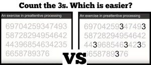
You're reading and mentally counting. Then the second iteration of that, the threes are made a darker color than the rest.
I agree. It's hard to give it justice without the visual, but when the threes are the one thing that are different than the rest, they just jump off the page at you. You don't even have to blink or think, and suddenly you can see how many threes there are on the page.
That's meant to illustrate the power of preattentive attributes. These are visual attributes that we're hardwired to pick up very quickly ‑‑ things like differences in color, size, relative position on page.
These are things that grab our attention almost before we even know that they're grabbing our attention. Preattentive attributes, when used sparingly in visual communication, can help our audience understand where they should be looking and what they should be seeing before they even know they're seeing it.
Really powerful tools ‑‑ color, especially, when used sparingly. If you can picture everything on a slide or everything in a graph is shades of gray, except you pick a single, bold color, and use that sparingly to draw your audience's attention, can be really effective on helping your audience to focus, and helping them know what to pay attention to.
Alzay: I think what I'll do is I'll take some screenshots, and I'll include that in our interview here. That's the basic idea I wanted to get across, is it's the same concept as why we bold things as we type.
Cole: Yes, it is another question, exactly.
Alzay: We're trying to draw your attention to a certain item. Bottom line, if you're trying to present data and you want someone to reach a certain conclusion, bold it. [laughs]
Instead of hiding it among different...Go ahead.
Cole: My two tips, more than anything other, in that scenario where I described ‑‑ you are presenting something and you want to get something specific across to your audience, draw attention there.
Use color sparingly, or bold, or do something else to set it apart, and put that takeaway into words. Don't assume that two different people looking at the same graph or at the same data are going to walk away with the same conclusion.
If there's a conclusion that you want them to reach, state it in words. Use what we know about preattentive attributes to make those words stand out. Make them big. Make them bold. Put them in high‑priority places on the screen, like the top.
Alzay: These are the kinds of things that sound so obvious while we're talking about them.
Cole: And yet so often we don't put them into practice. Yes.
Alzay: Right. We watch someone else present something, we go, "I can't understand what they're talking about," et cetera, et cetera. Excellent, excellent.
In your business, what big things are you working on right now? What do you have coming up?
Cole: Certainly my biggest thing is the book, which came out in November, and trying to spread the word there. It's meant to be useful for anybody who communicates visually with data, and a lot of the principles that we talk about us, they're shown through data, but they're really relevant to any sort of visual communications.
It's all about thinking about your audience. What do you need to get across to them? How do you design your visuals in a way that are going to do that? From what sort of graph do you chose in certain situations to some of the stuff we talked about when it comes to how do you use color effectively, and other things of that sort.
And has a whole lot of before and after examples, best practices and insight into the data visualization and storytelling with data process. It's meant to be really practical, and that the reader can start applying what they're reading immediately.
That's my biggest project of the moment.
Alzay: Good deal. If someone wants to contact you and learn more about your work, how should they do that?
Cole: My website's a great starting place. That's storytellingwithdata.com, and there's a contact page there if you have specific questions. There's also a blog on this topic there, so if you're looking for more examples, that'd be a good place to start.
Alzay: Cole, we've done a good job today. We've covered a lot in a very short amount of time. Thank you for your time today, and best of luck.
Cole: Great, Alzay. Thanks for having me.
Save this interview for later. Click this link to ---> download the interview transcription
Find Your Best Work.
You've done the work. You've gotten the results. You just haven't had a way to organize what you know so it's ready when the moment arrives.
Let's fix that together. It starts with one conversation.

Alzay Calhoun
Alzay Calhoun believes that consultants don't need more tactics — they need a place to think. For 13+ years, he's helped experts earning $100K–$500K find their best work and build systems around it. "The frameworks behind Coveted Consultant were built from real client work. They're documented across 505 YouTube videos, 25+ case studies, and an ongoing coaching practice.